TileUi
Purpose
-
Demonstrate Sample UI 'elements' made from tiles.
-
It's not a complete UI system and it's not made to be. BUT it's an easy way to add interactive features to your 2D game.
-
A button does not have to look like one!
Requires 'New Input System'
This is an example of how to use TpActionToTile and the TpInputActionToTile component as well as hovering for tooltips and hovering for animation.
On the left is an AnimatedButtonTile. It supports changing animation on hover and on click. It uses a simple event action which changes the value of the AsciiChar tile just above it.
Clicking on a number in the Keypad area will
- change color of the number for a few hundred mSec (this is set via a variable in the tile instance).
- make a noise using a callback to this component. The noise is different depending on if a tile was clicked or not.
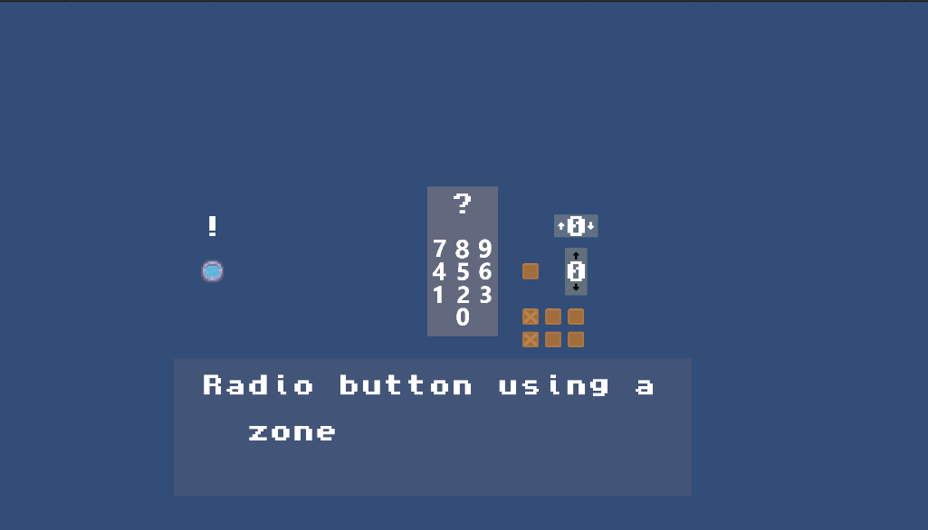
The box next to the keypad is a toggle and the two sets of boxes underneath that are two sets of radio buttons. One uses tags and the other uses Zones to create a radio group.
The number dials comprise up/down arrows and a UiAsciiCharTile to show the number.
Clicking on the arrow buttons will make the numbers go up/down. That's done with ZoneActions.
Each one of these buttons implements a 1x1 zone that's placed over the number tile that's between the buttons. You can see this
with Painter's Edit mode: select one of these and click visualize in the Zone controls section.
- These are all of size 1x1 and offset by +- 1 in the X or Y direction.
The 'HZ' tiles are Hover Zones. These can be used for tooltips. In this example, they're used to print a description of the Control in the text box.
- The text box is a set of AsciiChar tiles managed by an AsciiString tile. AsciiString tiles use a zone around some number of AsciiChar tiles to create an area to show text.
- When you hover over an area demarked by a HoverZone the text description of that area is sent to the AsciiString tile for display.
All of the "which tile is it" code etc is in TpActionToTile.cs which is managed by the TpInputActionToTile mono-component.